Do

For further global informations about both icons & pictograms, please read our intrudction.
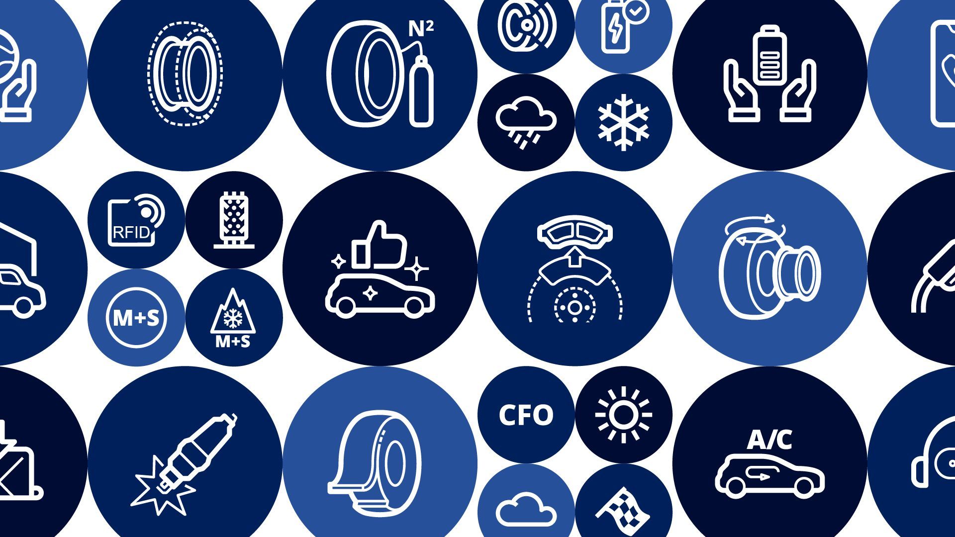
All Michelin pictograms follow the same design grid, padding, and are as much as possible inspired by primitive shapes when applicable. The grid helps guide design choices, contributing to a unified approach to the pictogram system. It allows flexibility in creating appropriate, precise, and uniform shapes to effectively communicate the right message.


All pictograms are designed on a 48px*48px grid. This 48px*48px grid is the smallest size for a pictogram (in contrast to icons, which are designed at a 2:2 scale). By designing a pictogram at a 1:1 scale, we ensure its readability and understanding at all larger sizes.

The grid includes an internal padding of 2 units (2px) all around. This ensures that pictograms maintain their integrity and the desired empty spaces when exported. No design element should appear in this space, except in exceptional cases (e.g., caps, joins, large icons, tall icons, etc.). Under no circumstances should the design exceed the grid.


Primitive, basic, or reference shapes are used to create the most uniform designs possible in a set/kit of pictograms. This helps establish stable foundations within the kit. It creates a connection between different creations that share the same basic shapes (e.g., a smartphone, a laptop, and a tablet; a compass and a clock; a ticket, a book, and a document, etc.).
Examples:

To ensure a clear and consistent user experience, it is essential to maintain visual and conceptual coherence between the pictograms and icons used across all Michelin mediums. Certain symbols, such as the car or the tire, frequently appear in various contexts:
For example, in the "business line 4W" pictogram and the "Search by HSN/TSN" pictogram, the car symbol is used.
To avoid confusing users and preserve intuitive understanding, it is recommended not to multiply variations of these symbols. Each reuse should follow a unified design: same style, same proportions, same level of detail. This helps reinforce the overall visual identity and makes it easier for users to recognize the associated concepts.

Authorized pictogram styles:
Semi-solid: Solid shapes and hollow shapes
Outlined: Shapes made from strokes
Filled-outlined: Solid shapes and strokes
Flat: Solid shapes in different colors
These styles were selected to maximize the impact, readability, and coherence of graphic elements across all Michelin interfaces.
Other styles, such as "solid" and "handdrawn," are not suitable for the use and design of pictograms. "Solid" is too coarse for pictograms, and "handdrawn" is too childish/playful for the Michelin universe.
To know more about icons & pictograms different styles, please read our dedicated section.
Color styles
In the Michelin ecosystem, pictograms can be:
Monochrome : One color
Colored:
Bicolor/Tricolor : Two/Three colors or tints & shades from the same color
Multiple colors
Monochrome

Bicolor

Shaded

Multicolor

To know more about the Michelin colors, please check ou branded colors dedicated page.
To standardize the appearance of pictograms across Michelin interfaces, we only use stroke thicknesses of 2px and 1px at the 1:1 design scale, meaning 48px*48px.
To maintain consistency and uniformity across all designs, it is essential to limit the use of these two stroke thicknesses.

Butt caps should be preferred for stroke endings. Especially in designs where roundness is added, butt caps provide a sense of anchorage and stability to the creation.

All joints in an icon design are rounded. The "round join" creates lighter, softer, and more aesthetically pleasing designs compared to its counterparts, "miter join" and "bevel join."

The "corners" also follow the grid. Start with 1px as the smallest, then 2px, 4px, 6px, and ideally continue with multiples of 2 as much as possible, up to a full circle.

It is necessary to use 45° inclinations for the most uniform anti-aliasing possible. For other inclinations, use increments of 15° whenever possible during the design of an icon. This will create harmony in the icon sets by ensuring that the angles are consistently placed on the same increments.

For further accessibility & contrast checking informations, please read our accessibility section in the introduction.
To know when and how you can contribute to our libraries and our guidelines, please check our contribution page.