Do
For further global informations about both icons & pictograms, please read our intrudction.
Pictograms can be used in a range of sizes, with the smallest size being 48px. The largest size can vary depending on the usage. However, all sizes must be multiples of 8 to align with the grid specifications.

Pictograms, like icons, are visually aligned at the center of their grid. Centering the pictograms within their grid ensures that all pictograms are aligned in the same way when used side by side. In some cases, a pictogram may not be centered arbitrarily for design balance reasons. In such cases, it is manually adjusted based on the weight and bulk of the design to satisfy visual harmony.

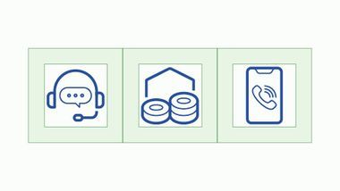
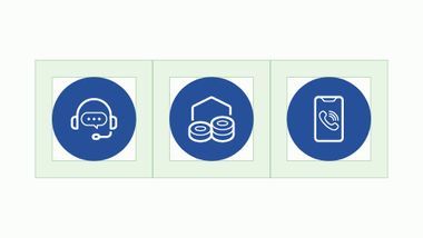
Pictograms can be represented in containers of different shapes, such as circles, squares, or squares with rounded corners. An internal margin rule must be followed, at design scale (48px*48px) : 8px for circle containers and 12px for square containers.
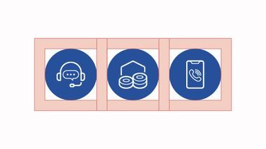
Example with circle containers

Example with squared containers

Example with rounded containers

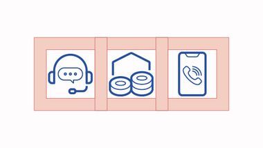
Different from the "target size" intended for interaction, the "safe area" refers to ensuring breathing space around the pictogram. The rule applies equally with or without a container. When pictograms are placed side by side or with other elements, a minimum margin of one-fourth must be maintained (for example, 12px for 48px pictograms).

In the Michelin ecosystem, pictograms can be:
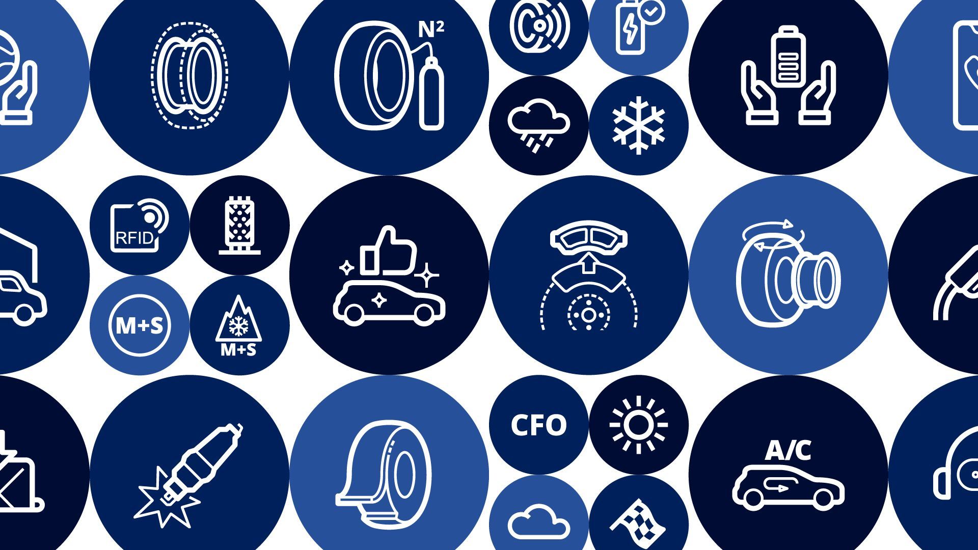
Monochrome : One color
Colored:
Bicolor/Tricolor : Two/Three colors or tints & shades from the same color
Multiple colors
Monochrome

Bicolor

Shaded

Multicolor


For further accessibility & contrast checking informations, please read our accessibility section in the introduction.
To know when and how you can contribute to our libraries and our guidelines, please check our contribution page.