Do

The icons have been designed to be as readable as possible in 4 different sizes:
16px, 20px, 24px, 32px
Icon size | Stroke width | Padding | Live area | Round corners | Associate with font size |
|---|---|---|---|---|---|
32px | 2px | 2px | 28px | 2px | - |
24px | 1.5px | 1.5px | 21px | 1.5px | - |
20px | 1.25px | 1.25px | 17.5px | 1.25px | 16px |
16px | 1px | 1px | 14px | 1px | 14px |
The design size of an icon is 32px*32px (2:2). This way, when the size is scaled down to 16px*16px (1:1), all the details are at least 1px to remain legible. It is therefore impossible to have strokes or details smaller than 1px in all size variations.
Stop using 12px icon size, it is unreadable, it should be discarded
Create an inbetween icon size of 20px, going from 16px to 24px is a huge gap, even if we tend to respect an increment of 8px, at small scale this size is realy needed
Don’t use icons over 32px, icons are meant to be used at small scale, starting 48px icons will start to look like pictograms
When associated with text
Both icons and pictograms are visually centered within their grid. Centering the icons in their grid ensures that all icons are aligned in the same way when placed side by side. There may be cases where an icon is not centered arbitrarily for design balance reasons. In such cases, it is manually centered based on the weight and visual clutter of the design to satisfy the eye.
In case of a non-clickable icon
Different from the "target size" intended for interaction, the "safe area" refers to ensuring breathing space around the icon. This rule applies the same way, with or without a container. When icons are placed side by side, or with other elements, a minimum margin of one-fourth should be maintained (for example, 4px for icons of 16px).
In case of a clickable icon.
Target zone (clickable area) of UI icons needs to be at least 48px*48px or larger to be easily accessible and clickable.
Example: A 32px icon needs a minimum additional padding of 8px (top, right, bottom, left) to create a clickable area of 48px*48px.
These paddings cannot overlap. In our example, between two icons, there must be 2*8px = 16px of space.
Color associations
All icons are of the "solid," "semi-solid," or "outlined" style, they are monochrome and must pass a contrast ratio test, just like typography (minimum 4.5:1, the higher, the better). The color of the icon should reflect its importance, action, and utility within the interface, to always guide the user as effectively as possible. The color should match that of the text in the case of a label or a button.
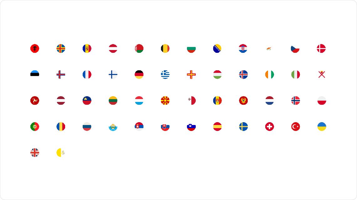
Country flags
Country flags, although used as graphic elements in our materials, are subject to specific designs that adhere to international standards or the cultural particularities of the nations concerned. These elements must follow the same global usage rules defined in these guidelines (size, target size, alignment, safe areas, etc.). However, the design rules outlined in these guidelines do not apply to flags. To ensure proper usage, it is essential to strictly follow the specifications provided by the designers in the approved mockups.
Social networks logos
Social media logos are trademarked and subject to strict guidelines established by the companies that own them. As with other graphic elements, they must adhere to the global usage rules defined in these guidelines (size, target size, alignment, safe areas, etc.). However, the design rules outlined in these guidelines do not apply to these logos. It is essential to refer to the designers' specifications in the mockups or the official guidelines of the respective companies for any usage.
For further accessibility & contrast checking informations, please read our accessibility section in the introduction.
To know when and how you can contribute to our libraries and our guidelines, please check our contribution page.