Icons - Design
Icons & Pictograms - Introduction
For further global informations about both icons & pictograms, please read our intrudction.
Fundations
All Michelin icons follow the same design grid, padding, and are inspired as much as possible by primitive shapes when applicable. The grid helps guide design choices and contributes to ensuring a unified approach to the icon system. It provides flexibility in creating appropriate, precise, and uniform shapes to effectively communicate the intended idea.
Anatomy of an Icon
Grid
All icons are designed on a 32px 32px grid. The design scale is therefore 2:2, not 1:1 (16px 16px), to facilitate the creation process. The icons are then scaled down to sizes of 24px, 20px, and 16px.
Padding
The grid includes an internal padding of 2 units (2px) all around. This ensures that the icons maintain their integrity and the desired empty spaces during export. No design element should appear in this space, except in exceptional cases (caps, joins, wide icons, tall icons, etc.). In no case should the design extend beyond the grid.
Primitive Shapes
Primitive, basic, or reference shapes are used to create the most uniform designs possible within an icon set/kit. This helps build stable foundations for the kit. It creates a connection between different symbols that share the same basic shapes (for example: a smartphone, a laptop, and a tablet – a compass and a clock – a ticket, a book, and a document, etc.).
Consistency & Re-use of Key Symbols
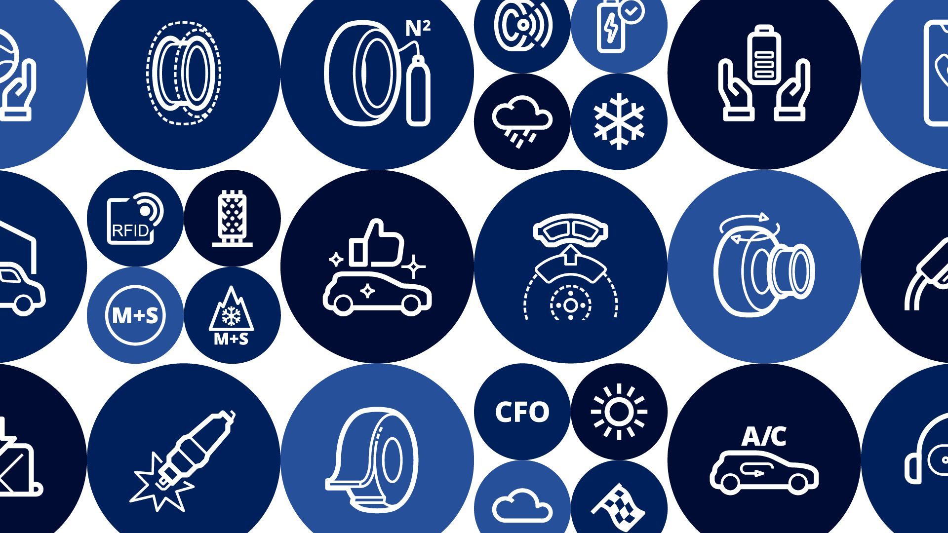
To ensure a clear and consistent user experience, it is essential to maintain visual and conceptual coherence between the pictograms and icons used across all Michelin mediums. Certain symbols, such as the car or the tire, frequently appear in various contexts:
To avoid confusing users and preserve intuitive understanding, it is recommended not to multiply variations of these symbols. Each reuse should follow a unified design: same style, same proportions, same level of detail. This helps reinforce the overall visual identity and makes it easier for users to recognize the associated concepts.
Style
Authorized icon styles:
Solid: Filled shapes
Semi-solid: Filled and outlined shapes
Outlined: Shapes made from strokes
These styles have been selected to maximize impact, readability, and consistency of graphic elements across all Michelin interfaces.
Other styles, such as "filled-outlined," "flat," or "handdrawn," are not suitable for icon usage and design.
To know more about icons & pictograms different styles, please read our deditcated section.
Colors
n the Michelin ecosystem, icons can be:
Monochrome : One color
Strokes
No icon should appear thicker or thinner than another. This is why all icons are designed with 2px thick strokes (on the 32px*32px design grid). There should also be no difference in stroke thickness within a single design.
Caps - Butt caps
Butt caps should be preferred for the termination of strokes. Especially in a design where roundness is added, butt caps help provide a sense of grounding and stability to the creation.
Joins - Round joins
All joins in an icon design are rounded. The "round join" creates lighter, softer, and more aesthetically pleasing designs compared to its counterparts, the "miter join" and "bevel join."
Corners
The "corners" also follow the grid. 1px, the smallest, 2px, then 4px, and 6px... ideally, a multiple of 2 as much as possible, up to a full circle.
Angles
Inclinations of 45° should be used for the most uniform anti-aliasing possible. For other angles, increments of 15° should be used whenever possible when designing an icon. This will create harmony in the icon kit by ensuring that the angles are consistently placed at the same increments.
Details
Details that cannot be designed with strokes, but rather with filled shapes (like the small circles here), as well as "empty" details and "white spaces" (such as the gaps between the tire treads), follow the same logic as the rest. These details should not be smaller than 2px and must align with the g