Do
Limit the risk of misunderstanding
Recommandations :
The design must be memorable and easy to describe, without rebus effect or symbols that are difficult to assimilate
2D is prefered to 3D
Accessibility is not only for people with apparent disabilities. It concerns the majority of the population, including older adults with changing vision or dexterity, people with temporary injuries, those in environments with poor lighting, and users on mobile devices who may need larger text or simplified navigation for ease of use.
Design-wise
Recommandations :
Always design icons and pictograms at the smallest scale to make sure your designs will be readable and understandable in every size variants (see design guidelines)
Use geometric & simple symbols widedly acquired by your audience (in every country, every culture)
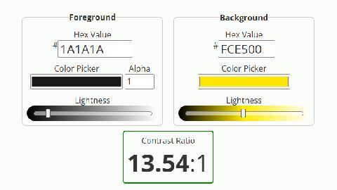
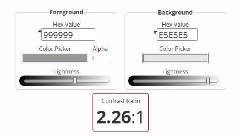
How to check your design contrast ? Are you using the right combination of colors ?
To ensure that our designs are accessible to as many people as possible, we must focus on certain tools and standards. Contrast is one of the most important factors to consider, as it ensures that text and graphic elements are legible for people with visual impairments. Tools like a contrast checker help us assess if our color combinations meet the required standards.
One key guideline for web accessibility is the WCAG (Web Content Accessibility Guidelines), which sets standards for making content accessible. There are different levels of compliance:
WCAG Level AA: This is the standard level of accessibility, ensuring that the majority of people with disabilities can access the content.
WCAG Level AAA: This is the highest level of accessibility, aiming to make content accessible to everyone, including users with more severe disabilities.
Using these tools and guidelines in our design process is crucial not only for compliance but for creating more inclusive and user-friendly experiences for everyone, regardless of their abilities.
Ressources
Contrast checker tool :
Contrast definition :
Contrast refers to the difference between two elements, such as text or graphic element and background, to make sure they are easy to distinguish. In design, having good contrast means that the element stands out clearly against its background, making it easier to read, especially for people with visual impairments. For example, dark text on a light background or light text on a dark background provides good contrast.